Sunday 28 December 2014

Speed Painting: If Christmas Trees Were Rocketships


Had a quick 15 mins before going out, so here we are! My first attempt at speed painting. Lots of fun!

Friday 12 December 2014

WIM - Creative Partnership Archived

Feedback From Others to Me:

Issey Miyake research
Hey Emma! Just thought I'd let you know that we're creative partners for this project! Great to see you already understand your artist, hope to see some thumbnails soon! :)
 
What If? Metropolis - thumbnails 1-21
I like 19 and 21, very interesting shapes! You could look into different folding techniques if you want to build a more interesting pleated look?

http://media.janm.org/exhibitions/foldingpaper/artists/JANM-FoldingPaper-Sweeney.jpg
http://cms.supadu.com/graphics/cropthumbnail?width=658&height=377&resizeThumb=yes&orientation=horizontal&imgSrc=/images/ckfinder/458/images/FT5.jpg
http://static.squarespace.com/static/50f0958ee4b0ceb75bc898e2/51ad0a32e4b0e0b133184e7d/51ad0ab8e4b0ee3fa6475843/1370374521424/CLOSEUP.jpg
 
A few more city thumbnails 24-59
I think 28 and 33 are interesting! I also like the colour in 41 :)
 
Thumnails 98-113
I bet Jordan did that in a few minutes as well, show off. They're looking nice though, you've got a lot of great forms there. Really like 98, 111 and 113, they have great texture and form
 
These are looking quite abstract and organic. The fibre textures you've added really bring in depth and a sense of volume. 98, 110 and 105 definitely stand out for me.

I agree with Jordan in that a dash of colour could make it amazing
 
Thumbnails 114-121
Well done :) I love 118, the skewed strange angles of them and the landscape in 114 and 117, 117 feels like a river of some kind, its really good
 
More thumbnails (122-125)
I love these, Brem's ghost even made an appearance. 123 and 125 are the most interesting for me.
 
I agree 123 is really lovely! The lasso tool is working really well for you here :)
 
Emma these are lovely! :) I think 122 would make a great interior and 123 has a nice open space to it! Good job, keep up the awesome work!
 
124 seems like it could be an interesting interior space to some noteworthy building. I also like the shapes in 123, it almost looks like Brem's Ghost is standing on a bridge-like walkway.
 
Final Compositions
That composition is looking wonderful Emma! Can't wait to see the colour on it! :)
 
Final Concept Art?? 
that's a interesting concept art i like the coulees and the curves i really works well make the whole piece look like a modern architecture concept art piece 
 
Love all the curved buildings, really makes it feel quite modern. The textures are also very nice, not 100 percent sure about the composition though, it feels quite empty for a city. 
 
These are come very fluid and organic buildings. The birds at the top being the same pattern and style as the rest of the composition are a very nice touch.

The ground in front of the structure at the back looks like water to me.
 
WIM - Building sketches 
Looking good so far though Emma! That building might be a little difficult to model but at least attempt it and show some progress, if not you have the back up of the matte painting! Your composition is looking pretty good in 3D as well just keep cracking on :)
 
 
From Me to Others:
 
To Kayliegh:
 
Oh, this looks so great, Kayliegh. Love the colours and the textures are brilliant. Almost there! :)
 
Great start Kayliegh! I can't wait to see your city come to life. I quite like the different views you've used in the smaller screenshots above too. Keep going! :)
 
Oh Kayliegh, this is excellent!! It really feels like it has a lot more depth and space to it now and I love the metal structures. :)
 
Hi Kayliegh, I like the 2nd one best. I think it has the right amount of structures but still with a good sense of space. I like number 4 too - mainly for the background :)
 
I like the colours and the eeriness of number 2, but number 3 grabs me as well. But I like number 4 too, aarrgh!! I can see your frustration. I think in terms of a complete city, maybe number 4 as it seems to have a mixture of some of the elements of both in it. I think I like the shapes and textures of number 4 best too. :)
 
Kayliegh, these are looking so great! I reckon you could definitely do something with the eye image in 109. 105 and 110 are also favourites of mine from the top thumbnails. I agree with Ella - I think you need to go 3D now and think of your city as a whole. Look at the transformation your city has made from the beginning!! It's great! :D 
 
Wow, these are brilliant Kayliegh! I really like 100 and 104. Looking forward to seeing some more :)
 
I really like 53, particularly the textures and colours, and 55 makes me want to go in and explore! Lots of favourites with the building shapes - 65, 67 and 70 are favourites of mine too, though I think you have loads to use there. :)
 
Great idea to do the collage! I really like number 46. I think of the top ones, 17 looks like it has great potential. Lots of layers to it and it feels like you are passing a city of some sort. I really love the shapes in 20 and 24 too. They look quite creepy and seem very fitting with Max Ernst's work.
 
To Mark:
 
This looks great, Mark. Fantastic to see it finished. I love the way you've lit the city. It really makes it to come to life. Having the mixture of modelling and matte painting really adds the depth too.
 
Hi Mark, I think 4, 7 & 8 are my favourites as you've really managed to capture of feeling of depth in your thumbnails. They would also by good for layering up when it comes to putting together matte painting and Maya I think. :)
 
I love the shapes you are using, Mark. Number 120 looks fantastic and I really want to see more of it. I really like the way you paint .:)
 
Mark, I love your group pixelation video, it's great! Some really clever and fun ideas and the animation flowed really nicely.
 

What if? Metropolis - Submission Disc Artwork


Production Designer Who's Who - Hans Bacher


Tuesday 9 December 2014

Film Review: Only God Forgives (2013)

Fig.1 Only God Forgives, Movie Poster (2013)
 
Brought to us by Drive director Nicolas Winding Refn, Only God Forgives is a neo-noir/art-house picture starring Ryan Gosling and Kristin Scott Thomas. The film has received varying reviews including 5/5 from Empire Online and only 40% from Rotten Tomatoes. Ali Arikan describes the film for Roger Ebert online as "an overly directed film that strives for effect with each scene. (Arikan, 2013). Although many feel the movie is lacking in certain aspects, the production art and the sound are two of the more successful features. The majority of the film is set at night, immediately giving a more moody and dangerous feel and bright colour is used extensively to depict the feel of the particular scene, predominantly with contrasting blues and reds. (Figs 2 & 3).
 
Fig.2 Use of colour - blues, Movie Still (2013) 

Fig.3 Use of colour - reds, Movie Still (2013)


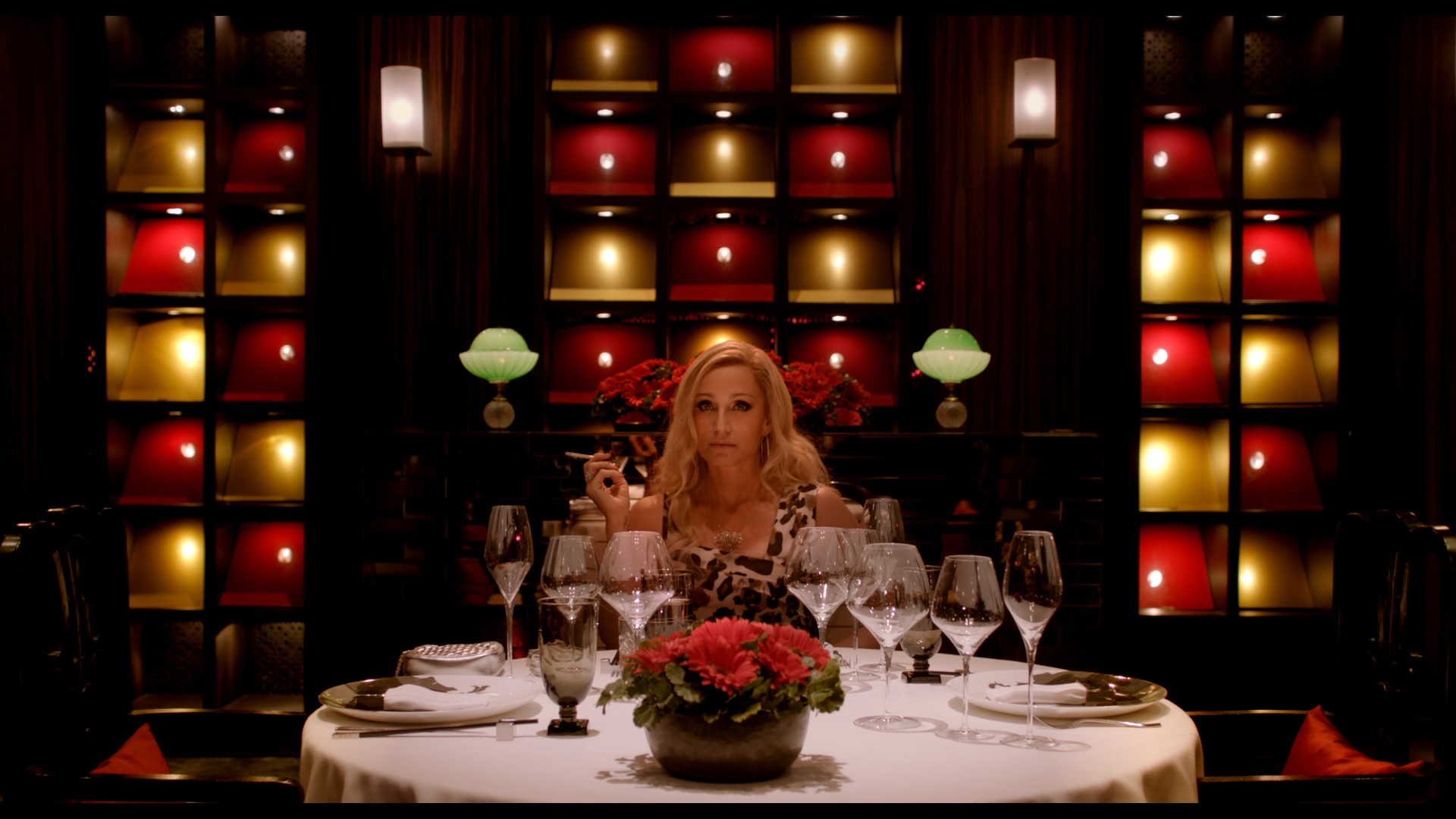
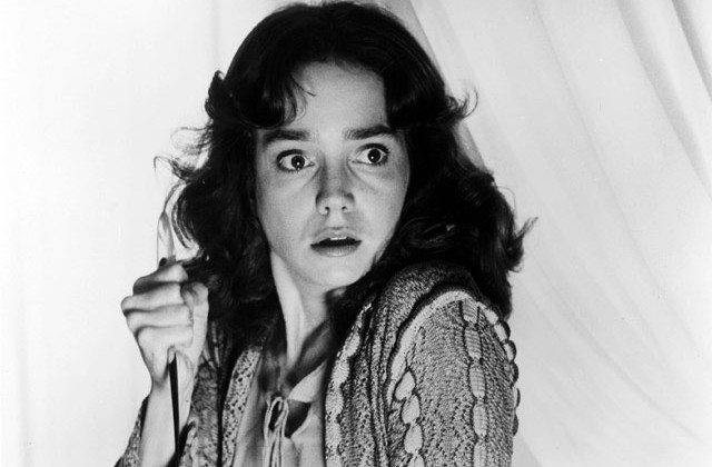
The film is set in Bangkok, Thailand and centres around main character Julian, played by Gosling. He is an ex-pat who runs a Muay Thai boxing club which fronts the drug smuggling business he runs with his brother, Billy. Revenge seems to be the main theme of the film and Winding Refn is very graphic and grotesque when it comes to violence. When Billy is killed to avenge the murder of a prostitute, Julian's mother Crystal (Fig.4) arrives to find the man who murdered her son. Also on the scene is the mysterious semi-retired policeman, Chang (Fig.5), known locally as the Angel of Death. Chang, played by Vithaya Pansringarm, has a penchant for karaoke and kills his victims with a bushido sword which he magically produces from behind his back (Fig.6). Ultimately, Chang and Crystal are searching to kill each other, with the frustrated Julian playing 'piggy in the middle'.
 

Fig.4 Julian's mother, Crystal, Movie Still (2013)
 
Fig. 5 Chang, the Angel of Death, Movie Still (2013)
 
Fig.6 Karaoke Chang, Movie Still (2013)
 
There is an obvious theme in the film of frustration and restraint when it comes to the character of Julian. His mother is very controlling and Julian feels so loyal to her that it affects his relationships with women. He has an obvious love interest in the film but holds back when it comes to any physical contact with her. His fists are clenched often, depicting restriction and also possibly defence (Fig.7). The only time we see a break through in his advances are when his mother is killed and he purposefully cuts open her stomach and puts his hand into her body. This is surely a reference to being back in the womb and the closeness he always longed for but never had. Damon Wise describes the character in his Empire Online review as "a hallucinatory study of guilt and a punishing vision of one man's private purgatory." (Wise, 2013). Gosling has less than 20 lines in the entire film, so much of the portrayal of his character is through his silent emotions and the impression one gets through the absence of dialect.
 

Fig.7 Julian with clenched fists, Movie Still (2013)
 
Undoubtedly a film that many will argue over for years to come, Only God Forgives is memorable mainly for its violence, production art, lighting and sound. The ending is unannounced and it would take more than one viewing to completely form opinions. In his Telegraph review, Robbie Collin says "Some of the most adrenalizing moments in motor racing are not the victories but the crashes, and Only God Forgives is the spectacle of a brilliant young director spinning out in style. It's a beautiful disaster." (Collin, 2013). Maybe not a film to suit everyone, but one that will keep you guessing for days about what actually happened. So much so that you will most probably want to watch it again.
 
Illustration List:
 
Figure 1 - Only God Forgives (2013) [Movie Poster] At:
(Accessed 09.12.14)
Figure 2 - Use of colour - blues (2013) [Movie Still] At:
(Accessed 09.12.14)
Figure 3 - Use of colour - reds (2013) [Movie Still] At:
(Accessed on 09.12.14)
Figure 4 - Julian's mother, Crystal (2013) [Movie Still] At:
(Accessed on 09.12.14)
Figure 5 - Chang, the Angel of Death (2013) [Movie Still] At:
(Accessed on 09.12.14)
Figure 6 - Chang does Karaoke (2013) [Movie Still] At:
(Accessed on 09.12.14)
Figure 7 - Julian with clenched fists (2013) [Movie Still] At:
(Accessed on 09.12.14)
 
Bibliography:
 
Arikan, A (19th July 2013), Robert Ebert review, At:
(Accessed on 09.12.14)
 
Collin, R (1st August 2013), The Telegraph review, At:
(Accessed on 09.12.14)
 
Wise, D (s.d.) Empire Online review, At:
(Accessed on 09.12.14)

Modelling in Maya

 
Think I'm getting there with the modelling and am completely aware that I should have finished this by now. Have been struggling with trying to recreate the shapes I liked in my concept art and have made so many variations, though I think I have settled on these now. I tried the technique Jordan suggested, which is the same as the way I made the buildings in my concept art. I've created a plane which I've added an image to and then used the animation tools, the soft select option and the vertex selections to warp and distort the flat square into 3D buildings.

At the back I've added a couple more planes to layer up the backdrop and I've also managed to model the 'theatre' from my concept art. This one was really daunting, but Simon suggested starting with a polygon helix which I've then warped, extruded and rotated to create this shell-like structure.

It's looking a tad messy at the moment, but I'm hoping a bit of texturing and lighting will help tidy that up! Plodding on...

Wednesday 3 December 2014

WIM - Building sketches

 As per Jordan's instructions I'm putting these sketches up! I always forget to put sketchbook work on my blog and I did these a while ago. These are the buildings I'm hoping to model in Maya.

I see this as the main building in my city - some sort of Town Hall.
  
This I saw as a school or university. A very airy and light building with the option of opening up the sides to create an indoor/outdoor space. The interior would allow for rooms to be created or opened up as necessary with the use of canopies and screens.
 
I really, really want to model this in Maya, but know that it will be super-tricky. Jordan's given me some pointers so I think I'll get the other buildings out the way and then tackle this one at the end. I could create it on a matte painting, but I think that would be cheating a bit and I really want to have a go at modelling it.


 These are a couple of pages just getting my head around how the walkway will work. I started off with having straight poles which could be raised or lowered to change the height and shape of the canopied walkway, but after sketching some ideas I thought it'd look better as curved supports. Then these can be bent more or less to create height. Might look at insects and caterpillars to see how their legs work in the same way to raise and lower their bodies.


So when it came to Maya I was struggling with how to create the building shapes. I tried starting with cubes and cylinders, creating curves and deleting faces. After speaking to Jordan it turns out I can create the buildings with the exact same effect I used in the beginning when doing my concept art in Photoshop, using planes and then warping and skewing them to create shapes. The work above is what Jordan did, so I will try and recreate it myself now. This is the way I believe Issey Miyake would have worked had he been creating his own city. The animation tools will come in handy to add the bends I need, so lots of practicing making bendy shapes for me. I'm hoping the pleating effect can be replicated in this way too.


Film Review: Suspiria (1977)

Fig.1 Suspiria Movie Poster (1977)
 
Directed in 1977 by Dario Argento, Suspiria is a horror/slasher movie which will stay in your memory forever. Despite the questionable storyline, the lighting effects and haunting soundtrack are what makes this film so special. The story revolves around main character Suzy Bannion (played by Jessica Harper) who arrives from New York to a European ballet academy. A series of unexplained murders coupled with the strange night-time movements of the staff lead Suzy to investigate the suggestion of witchcraft in the school. Suzy manages to stay level-headed throughout the ordeal, despite the traumatic happenings around her and the discovery that the school was originally founded to study the occult by fabled witch Helena Markos. 


Fig.2 Main character Suzy Bannion, Film Still (1977)
 
Fig.3 Ballet instructor, Ms Tanner, Film Still (1977)
 
The powerful use of colour in this movie is such that it completely overtakes the characters and storyline, but it is obvious that this was Argento's intention (Fig.4). Red is most dominant as one would expect from this genre of film and when it comes to the death scenes, nothing is left to the imagination. The colour use, however, makes the gore seem more acceptable as Janet Maslin states in her New York Times review "Argento's methods make potentially stomach-turning material more interesting than it ought to be. Shooting on bold, very fake-looking sets, he uses bright primary colors and stark lines to create a campy, surreal atmosphere, and his distorted camera angles and crazy lighting turn out to be much more memorable than the carnage." (Maslin, 1977).
 
 
Fig.4 The powerful use of colour in the film, Movie Still (1977)
 
The production design puts the viewer on edge from the very beginning of the film both visually and through the disturbing soundtrack, created by Italian band Goblin. Flashes of colour through torrential rain give us the impression of blood splattering and the bright red of the ballet school building immediately warn us of danger (Fig.5). In her Eye for Film review, Jennie Kermode says of the movie "This is horror shot with dazzling energy yet with the visual depth and acuity of a Renaissance painting. Those who doubt the artistic potential of the horror genre should be nailed down and made to watch it." (Kermode, 2008).
 
 
Fig.5 The red walls of the ballet academy, Movie Still (1977)
 
Named after the Latin word for 'sighs'. Suspiria is an amazingly intense and haunting movie. The marriage of colour and sound create extreme uneasiness and one can never quite tell where the plot will take us next. Jason Buchanan sums up the film perfectly when he says in his All Movie review "this unrelenting tale of the supernatural was - and likely still is - the closest a filmmaker has come to capturing a nightmare on film." (Buchanan, s.d.). Although the violence and gore may be too extreme for some, they are worth tolerating to experience the amazing design of this notorious film which will leave a horror hangover that many more modern films of the genre fail to achieve.
 
 Fig.6 Use of colour to create tension, Movie Still (1977)
 
Illustration List:
 
Figure 1. Suspiria, (1977) [Movie Poster] At:
(Accessed on 02.12.14)
Figure 2. Main character Suzy Bannion, (1977) [Film Still] At:
(Accessed on 02.12.14)
Figure 3. Ballet instructor, Ms Tanner, (1977) [Film Still] At:
(Accessed on 02.12.14)
Figure 4. The powerful use of colour in the film, (1977) [Movie Still] At:
(Accessed on 02.12.14)
Figure 5. The red walls of the ballet academy, (1977) [Movie Still] At:
(Accessed on 02.12.14)
Figure 6. Use of colour to create tension, (1977) [Movie Still] At:
(Accessed on 02.12.14)
 
 
Bibliography:
 
Maslin, J (1977), NY Times review At:
(Accessed on 02.12.14)
 
Kermode, J (2008), Eye for Film review At:
(Accessed on 02.12.14)
 
Buchanan, J (s.d.) All Movie review At:
(Accessed on 02.12.14)
 

Monday 1 December 2014

Maya Cottage - Lighting & Rendering

Finally finished the Night-time exterior lighting scene so here they all are - four versions of the 'whimsy cottage'.

 
Midday exterior lighting

Sunset exterior lighting

Romantic exterior lighting
 
Night exterior lighting


Friday 28 November 2014

Zoetrope animations

 
The first idea I had for my Zoetrope was a Christmassy train. I think it worked ok on dragon but when I originally drew it out on the zoetrope strips it just looked like a long continuous train to me, so I scrapped the idea. I may revisit it later and make a regular animation of it as I like the idea.


One of the other alternatives to the train was this one of Father Christmas emerging from underneath a Christmas tree. I tested it in dragon and it seemed as though it would work much better in the zoetrope than the train idea, so I went with it!
 
 
This is the final animation in the zoetrope, ready for the show! :)
 

Wednesday 26 November 2014

Life drawing - 26/11/14

Added a bit of colour into our life drawings this week! These were all 10 minute poses with graphic pencil and coloured pencils.

This was a 30 minute post drawing Alan and a mannequin. I started with blue chalk pastel with water worked over the top and then painted the figures with black ink. Really enjoying using the inks today.

This was a 20 minute painting. I started with coloured inks and then used chalk pastel over the top and more ink to add details (plus some added ink splatters!). Much fun. :)

Tuesday 25 November 2014

Film Review: The Shining (1980)

Fig.1 The Shining, Movie Poster (1980)


Stanley Kubrick's 1980 film adaption of the Stephen King novel, The Shining is a horror masterpiece. From the very beginning it is evident that trouble is brewing when struggling writer Jack Torrence (played by Jack Nicholson) brings his wife, Wendy and young son, Danny to stay at the secluded and troubled Overlook Hotel for the winter months (Fig.2). Jack is employed as off-season caretaker with plans to work on his book, but when the isolation of the hotel and frustrations of writing get the better of him, things take a nasty turn.


 Fig.2. The Overlook Hotel, Movie Still (1980)
 
Although Kubrick never provides us with complete answers to the many questions raised in the film, it is evident from very early on that the Torrence family relationships are already fraught (Fig.3). Jack's sarcastic nature, teamed with his maniacal smile taunt us throughout the film and Shelley Duvall portrays Wendy as his nervous, but patient and long-suffering wife. We are given the impression that Jack is a violent, hot-tempered man, with a possible history of alcohol abuse. Their son, Danny posses psychic abilities and has an imaginary friend, called Tony, who warns him of the evil within the Overlook Hotel. The previous caretaker, named Grady, was said to lose his mind and kill not only his wife, but also his two young daughters who appear before Danny at several points in the movie (Fig.4).
 
Fig.3 The Torrence Family, Movie Still (1980)
 
Fig.4 The Grady twins, Movie Still (1980)
 
 
Kubrick is well known for the relentless detail he puts into his films and The Shining is no exception. As Ian Nathan says in his Empire Online review "In accordance with the Kubrick legend, the process of making the  movie took meticulousness to staggering levels - Shelley Duvall was reputedly forced to do no less than 127 takes of one scene; Nicholson was force fed endless cheese sandwiches (which he loathes) to generate a sense of inner revulsion, and the recent invention of the Steadicam (by Garret Brown) fuelled Kubrick's obsessive quest for perfection. The result is gloriously precision-made." (Nathan, s.d.)
 
The feeling of isolation and being trapped is evident throughout the film, not only in the labyrinth in the grounds of the hotel, but also in the carpets, the wallpaper and the Hotel itself (Fig.5) When taking a tour of the hotel, Wendy Torrence says "This whole place is such an enormous maze, I feel I'll have to leave a trail of breadcrumbs every time I come in." James Gracey talks of this in his Eye For Film review when he says "The motif of the maze is evident throughout the film's production design, repeated as it is in carpets, wallpapers, the never-ending empty hallways; it enhances the notion of doomed individuals who are trapped not only in a threatening physical space, but within their own minds, too." (Gracey, 2014). Kubrick also uses the symmetry and clean, cold environments so famous in all of his work (Fig.6) as well as a shrill and suspense-inducing classical soundtrack.
 
 
Fig.5. The Maze Carpet, Movie Still (1980)
 
 
Fig.6 Jack's Study at the Overlook Hotel, Movie Still (1980)


There are many intense parts of the movie and the viewer is constantly on the edge of their seat. As NY Times reviewer, Janet Maslin says "The Shining may be the first movie that ever made its audience jump with a title that simply says "Tuesday"." (Maslin, s.d.). The turning point of the film happens quite early on when Jack stumbles into the hotel bar known as The Gold Room. Here he sees hallucinations of 1920s party-goers and meets a waiter by the name of 'Grady'. Jack soon realises that Grady is, in fact, the previous caretaker who urges him to 'correct' his wife and son for their errors. Wendy meanwhile grows increasingly concerned about her husband's threatening behaviour and when she finds the repeatedly typed words "All work and no play makes Jack a dull boy" on his typewriter, she knows the time has come for her and Danny to make their escape (Fig.7).
 
Fig.7 - Jack's repeatedly typed warning, Movie Still (1980)
 
Although over thirty years old, The Shining has a timeless appeal that proves it to be one of the greatest films of all time. Even at a lengthy 144 minutes long, the film is paced in a such a way that our interest is kept throughout and at the end of the film we feel as though we have been through the entire ordeal and loved every minute.
 
 
Illustration List:
 
Figure 1. The Shining, (1980) [Poster] At:
(Accessed on 25.11.14)
Figure 3. The Torrence Family, (1980) [Movie Still] At:  http://www.otekisinema.com/wp-content/uploads/2014/08/The-Shining-1980.png
(Accessed on 25.11.14)
Figure 4. The Grady Twins, (1980) [Movie Still] At:
(Accessed on 25.11.14)
Figure 5. The Maze Carpet, (1980) [Movie Still] At:
(Accessed on 25.11.14)
Figure 7. "All work and no play makes Jack a dull boy", (1980) [Movie Still] At: http://cdn5.movieclips.com/warner-bros/t/the-shining-1980/0528914_17157_MC_Tx304.jpg
(Accessed on 25.11.14)

 
Bibliography:
 
Nathan, I (s.d.) Empire Online review At:
(Accessed on 25.11.14)
 
Gracey, J (Sept 2014) Eye For Film review At:
(Accessed on 25.11.14)
 
Maslin, J (s.d.) NY Times review At:
 (Accessed on 25.11.14)