Friday, 28 November 2014

Zoetrope animations

 
The first idea I had for my Zoetrope was a Christmassy train. I think it worked ok on dragon but when I originally drew it out on the zoetrope strips it just looked like a long continuous train to me, so I scrapped the idea. I may revisit it later and make a regular animation of it as I like the idea.


One of the other alternatives to the train was this one of Father Christmas emerging from underneath a Christmas tree. I tested it in dragon and it seemed as though it would work much better in the zoetrope than the train idea, so I went with it!
 
 
This is the final animation in the zoetrope, ready for the show! :)
 

Wednesday, 26 November 2014

Life drawing - 26/11/14

Added a bit of colour into our life drawings this week! These were all 10 minute poses with graphic pencil and coloured pencils.

This was a 30 minute post drawing Alan and a mannequin. I started with blue chalk pastel with water worked over the top and then painted the figures with black ink. Really enjoying using the inks today.

This was a 20 minute painting. I started with coloured inks and then used chalk pastel over the top and more ink to add details (plus some added ink splatters!). Much fun. :)

Tuesday, 25 November 2014

Film Review: The Shining (1980)

Fig.1 The Shining, Movie Poster (1980)


Stanley Kubrick's 1980 film adaption of the Stephen King novel, The Shining is a horror masterpiece. From the very beginning it is evident that trouble is brewing when struggling writer Jack Torrence (played by Jack Nicholson) brings his wife, Wendy and young son, Danny to stay at the secluded and troubled Overlook Hotel for the winter months (Fig.2). Jack is employed as off-season caretaker with plans to work on his book, but when the isolation of the hotel and frustrations of writing get the better of him, things take a nasty turn.


 Fig.2. The Overlook Hotel, Movie Still (1980)
 
Although Kubrick never provides us with complete answers to the many questions raised in the film, it is evident from very early on that the Torrence family relationships are already fraught (Fig.3). Jack's sarcastic nature, teamed with his maniacal smile taunt us throughout the film and Shelley Duvall portrays Wendy as his nervous, but patient and long-suffering wife. We are given the impression that Jack is a violent, hot-tempered man, with a possible history of alcohol abuse. Their son, Danny posses psychic abilities and has an imaginary friend, called Tony, who warns him of the evil within the Overlook Hotel. The previous caretaker, named Grady, was said to lose his mind and kill not only his wife, but also his two young daughters who appear before Danny at several points in the movie (Fig.4).
 
Fig.3 The Torrence Family, Movie Still (1980)
 
Fig.4 The Grady twins, Movie Still (1980)
 
 
Kubrick is well known for the relentless detail he puts into his films and The Shining is no exception. As Ian Nathan says in his Empire Online review "In accordance with the Kubrick legend, the process of making the  movie took meticulousness to staggering levels - Shelley Duvall was reputedly forced to do no less than 127 takes of one scene; Nicholson was force fed endless cheese sandwiches (which he loathes) to generate a sense of inner revulsion, and the recent invention of the Steadicam (by Garret Brown) fuelled Kubrick's obsessive quest for perfection. The result is gloriously precision-made." (Nathan, s.d.)
 
The feeling of isolation and being trapped is evident throughout the film, not only in the labyrinth in the grounds of the hotel, but also in the carpets, the wallpaper and the Hotel itself (Fig.5) When taking a tour of the hotel, Wendy Torrence says "This whole place is such an enormous maze, I feel I'll have to leave a trail of breadcrumbs every time I come in." James Gracey talks of this in his Eye For Film review when he says "The motif of the maze is evident throughout the film's production design, repeated as it is in carpets, wallpapers, the never-ending empty hallways; it enhances the notion of doomed individuals who are trapped not only in a threatening physical space, but within their own minds, too." (Gracey, 2014). Kubrick also uses the symmetry and clean, cold environments so famous in all of his work (Fig.6) as well as a shrill and suspense-inducing classical soundtrack.
 
 
Fig.5. The Maze Carpet, Movie Still (1980)
 
 
Fig.6 Jack's Study at the Overlook Hotel, Movie Still (1980)


There are many intense parts of the movie and the viewer is constantly on the edge of their seat. As NY Times reviewer, Janet Maslin says "The Shining may be the first movie that ever made its audience jump with a title that simply says "Tuesday"." (Maslin, s.d.). The turning point of the film happens quite early on when Jack stumbles into the hotel bar known as The Gold Room. Here he sees hallucinations of 1920s party-goers and meets a waiter by the name of 'Grady'. Jack soon realises that Grady is, in fact, the previous caretaker who urges him to 'correct' his wife and son for their errors. Wendy meanwhile grows increasingly concerned about her husband's threatening behaviour and when she finds the repeatedly typed words "All work and no play makes Jack a dull boy" on his typewriter, she knows the time has come for her and Danny to make their escape (Fig.7).
 
Fig.7 - Jack's repeatedly typed warning, Movie Still (1980)
 
Although over thirty years old, The Shining has a timeless appeal that proves it to be one of the greatest films of all time. Even at a lengthy 144 minutes long, the film is paced in a such a way that our interest is kept throughout and at the end of the film we feel as though we have been through the entire ordeal and loved every minute.
 
 
Illustration List:
 
Figure 1. The Shining, (1980) [Poster] At:
(Accessed on 25.11.14)
Figure 3. The Torrence Family, (1980) [Movie Still] At:  http://www.otekisinema.com/wp-content/uploads/2014/08/The-Shining-1980.png
(Accessed on 25.11.14)
Figure 4. The Grady Twins, (1980) [Movie Still] At:
(Accessed on 25.11.14)
Figure 5. The Maze Carpet, (1980) [Movie Still] At:
(Accessed on 25.11.14)
Figure 7. "All work and no play makes Jack a dull boy", (1980) [Movie Still] At: http://cdn5.movieclips.com/warner-bros/t/the-shining-1980/0528914_17157_MC_Tx304.jpg
(Accessed on 25.11.14)

 
Bibliography:
 
Nathan, I (s.d.) Empire Online review At:
(Accessed on 25.11.14)
 
Gracey, J (Sept 2014) Eye For Film review At:
(Accessed on 25.11.14)
 
Maslin, J (s.d.) NY Times review At:
 (Accessed on 25.11.14)


Wednesday, 19 November 2014

Final Concept Art??


Any comments or suggestions for my potential final concept painting? Not sure if it's not 'clean' enough anymore?! Aarggh!

Final Compositions

 So these were the compositions I narrowed down to and I'm working up the bottom one as my final piece. Very late in the day I know, but I'm still not completely decided on key assets and colour schemes. I am happy with all of these, so I have tried to amalgamate them as much as possible while still trying to keep a sense of space.
 
I like the colour in the first image and the sense of space, so these are the two I'd narrowed down to work on further.
 
I felt this one was becoming a bit too overcrowded and closed in, but I liked the colour, so will use this in my final comp.

So I've used the first image above (which is from my original thumbnail no. 123) and incorporated all the elements I liked from other thumbnails. I feel like I've got a good space here and want to try and keep everything quite open. I see this as just getting to the busier, more built-up part of the city, so we start to see key buildings and links to other parts, such as the entrance to the underground transport system and walkways to commercial areas, and we begin to feel the hum of the heart of the city.

Life drawing - 19/11/14

  
We started with a few quick drawings today working several poses on the same page, then moved on to more detailed studies. Thoroughly enjoyable as always!


10 minute poses with a graphic pencil


 5 min poses with graphite pencil                                     1 minute poses with charcoal


 Detailed studies


I can't draw feet and hands, so I decided to concentrate on feet and hands!


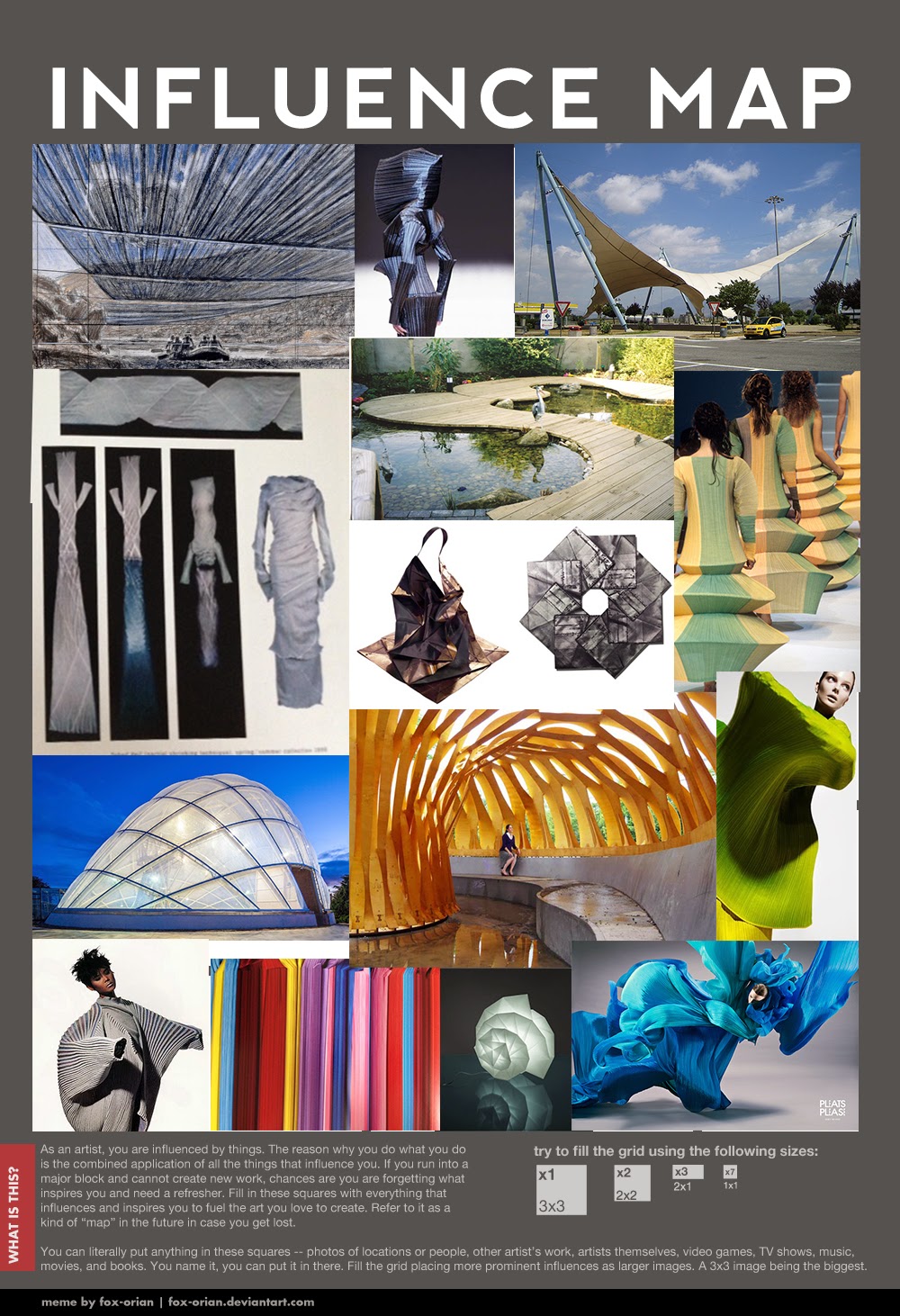
Definitive Influence Map ready for OGR 2


Tuesday, 18 November 2014

Film Review: Repulsion (1965)

Fig.1. Movie Poster (1965)
 
This black and white horror film set at the time it was made is the first instalment of Roman Polanski's "Apartment Trilogy" and stars Christine Deneuve as the troubled Carol. Living with her sister in Kensington the shy, beautiful young Belgian girl tries to go about her daily life but is harbouring an apparent repulsion to men. This isn't helped by unwanted attention on her journey to and from work every day (Fig.2). When her sister and married boyfriend go away to Italy, Carol is left alone in the apartment and gradually her mind overtakes her.
 
 
Fig.2 Carol receive unwanted attention from labourers, Movie Still (1965)
 
There is much disturbing imagery in this movie and although some points are quite slow, this is a deliberate act by Polanski to engage us further into the mind of Carol. She suffers hallucinations of cracks appearing in the walls, reflecting her increasingly fractured mind, and rape experiences every night, to which she becomes so familiar that she prepares herself for them towards the end of the movie. Throughout the film, those around her do not seem to acknowledge Carol's mental state enough to take action and the audience is left with a sense of not fear, but sadness towards her. Kim Newman says in her Empire Online review "Rather than making a mad person scary, this film terrifies by giving an audience a sense of what it's like to lose sanity." (Newman, s.d.)
 
Fig. 3 Carol sees cracks appearing in the walls, Movie Still (1965)

Considering the movie is set in the Sixties, we can see that Carol is very unlike many of the other women around her. She keeps herself away from men as much as possible and washes herself after any contact with them, including Colin, the kind-hearted man who is trying to win her affections. Eye For Film reviewer Jennie Kermode says "Her unbalanced state seems to reflect an unbalanced world whose expectations of her are themselves far from realistic." (Kermode, 2010). We are given the impression that Carol has suffered some form of abuse or neglect in her life, possibly from her father or someone close to her, most definitely a male. This is even more evident when we are shown a family photo in the film of Carol as a young girl, looking distant and removed from the scene. (Figs. 4 & 5).  

 Fig 4. Carol's family photo, Movie Still (1965)
 
 Fig.5 Close up of Carol from the family photo, Movie Still (1965)
              

This film is successful for many reasons; the sound design, the set design and the way the rooms get bigger as Carol's insanity grows, and also the clever timing of the film. Remembered as a classic psychological thriller, Repulsion received a rare 100% from Rotten Tomatoes film review website and is described by Peter Bradshaw of The Guardian as "a deeply disturbing, horribly convincing psychological thriller that is also that rarest of things: a scary movie in which a woman is permitted to do the killing." (Bradshaw, 2013).
 
Illustration List:
 
Figure 1. Repulsion, (1965) [Poster] At: http://pics.filmaffinity.com/Repulsion-581209058-large.jpg
(Accessed on 18.11.14)
 
(Accessed on 18.11.14)
 
Figure 3. Carol sees cracks appearing in the walls (1965) [Movie Still] At: http://lefthandhorror.files.wordpress.com/2012/10/repulsion6.png?w=800 
(Accessed on 18.11.14)
 
(Accessed on 18.11.14)

Figure 5. Close up of Carol from the family photo (1965) [Movie Still] At:  http://media.jinni.com/movie/repulsion/repulsion-1.jpeg
(Accessed on 18.11.14)
 
 
Bibliography:

Newman, K (s.d.) Empire Online review At: http://www.empireonline.com/reviews/reviewcomplete.asp?FID=134914
(Accessed on 18.11.14)

Kermode, J (2010) Eye for Film review At:
(Accessed on 18.11.14)

Bradshaw, P (2013) The Guardian review At: http://www.theguardian.com/film/2013/jan/03/repulsion-review
(Accessed on 18.11.14)


Saturday, 15 November 2014

More thumbnails (122-125)


A few more thumbnails from today. Trying to add in a bit of colour - need to be braver!!

Thumbnails 114-121


So I've taken some of my weird, warped, skewed and pleated shapes and put them together in compositions. I'm churning more out but feel like I'm still wrestling with Photoshop a tad - getting better every day though. Quite like 116 and 120 but can see other combinations within them all.

Wednesday, 12 November 2014

Life Drawing - 12/11/14

This week's life drawing class focused on negative space. I used mainly charcoal and chalk, but added a bit of pen and pencil to some of the drawings. I'm quite pleased with the first and last pages this week.

Both 10 minute poses, drawn with charcoal

These two drawings were both around 15-20 minutes for each stage. The first stage was drawn with charcoal, concentrating on the space around the model. The next phase was to add detail, which I did with a grey felt tip pen. Also used a putty rubber and a little bit more charcoal to add depth.

This is my favourite one this week. This was a 25 minute pose drawn with chalk, charcoal and black, brown and white coloured pencils.

Film Review: Book of Life (2014)


So I know it's not on our timetable, but I took my two biggest babies to see Book of Life in 3D at the cinema last week, so thought I'd write a little review (and practise my referencing!). I also think it was an amazing film to watch with regards to our Production Design project. Please be wary though of *POSSIBLE SPOILERS*!!
 
Fig. 1 Movie Poster (2014)


Directed by Jorge R. Gutierrez and Produced by Guillermo del Toro, The Book of Life is a feast for the eyes. The story revolves around two long term friends, Manolo and Joaquin and their quest to win the heart of their childhood love, Maria. When things don't go to plan, Manolo finds himself in the underworld and needs to call on the rulers of the Land of the Remembered and the Land of the Forgotten to bring him back from the dead to save the day.

Fig.2 Joaquin, Manolo and Maria, movie still (2014)
 
 
What makes this film so appealing is the amazing and colourful scenery, in particular The Land of the Remembered (fig.3). The character design is also wonderful; the characters are portrayed as wooden toys or puppets which adds to their charm and appeal. Although the most impressive parts of the movie are shown in the trailer, this was still a joy to watch, if a little predictable towards the end. Who cares though, when the amazing artwork and cute storyline keeps two small children and an excited grown-up beaming for an hour and a half? Check out this amazing concept and production art especially if, like me, you need a kick up the bum to get going with your project!

Fig.3 The Land of the Remembered, movie still (2014)
 
 
Fig.4 The Book of Life, production art (2014)

Fig.5 Cemetery, concept art (2014)

Fig.6 The Cave of Souls, concept art (2014)
 
 
Illustration List:
 
Figure 1 - The Book of Life (2014) [Poster] At: http://i0.wp.com/www.4ye.co.uk/wp-content/uploads/2014/10/book-of-life-7.jpg (Accessed on 11.11.14)
 
Figure 2 - Joaquin, Manolo and Maria (2014) [Movie still] At:
(Accessed on 11.11.14)
 
Figure 3 - The Land of the Remembered (2014) [Movie still] At:
(Accessed on 11.11.14)
 
(Accessed 11.11.14) **This website is great and has some tutorials which may be useful**
 
Figure 5 - The Book of Life (2014) [Concept art] At:
(Accessed on 11.11.14)
 
(Accessed on 11.11.14)